

Tuesday, May 31, 2011

Robot Render Passes
These are the different layers.
Diffuse
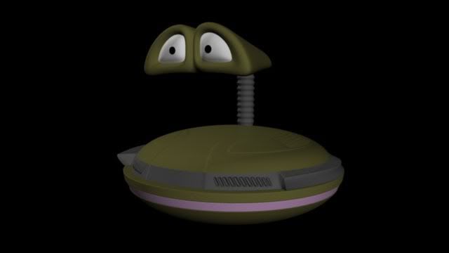
Flat Colour
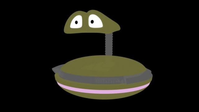
Ambient Occlusion
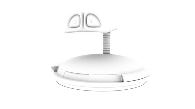
Specular
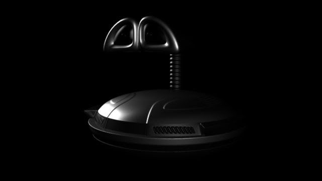
Completed
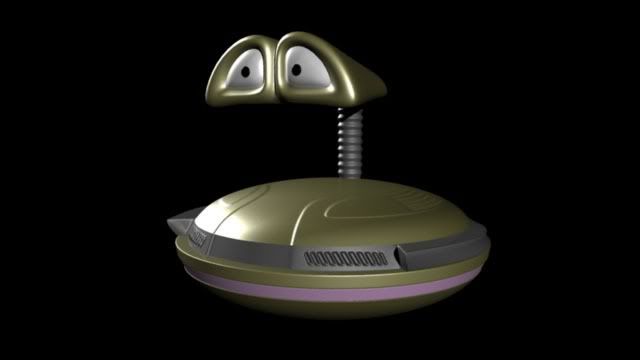
Diffuse

Flat Colour

Ambient Occlusion

Specular

Completed

Thursday, May 26, 2011
2001 Space Odyssey - The Postal Service - Research Part - 2

Wednesday, May 25, 2011
Ora-Ïto - Research Part - 1
 |
| A sculpture by Ora-ïto |
His clean style and sharp edges was something that proved of interest in my research. The white and shiny texture is what I am also going for. I decided to keep the shapes simple, and if the project had been less structured I would have gone for even more abstraction. I had done some research into shapes, lines and colour a while back, I find that this project has opened some doors for more animation. As I progressed more into the project more stylistic sources came to the fore.
Subscribe to:
Posts (Atom)