This is an interesting play with stop motion my brother did at the Museum of Moving Images in NYC. Mine got deleted the moment I was about to send it, but his I find quit funny in it's randomness. You only had a minute or two to work on it.

Showing posts with label The Rest. Show all posts
Showing posts with label The Rest. Show all posts
Tuesday, June 14, 2011

Thursday, May 26, 2011
2001 Space Odyssey - The Postal Service - Research Part - 2

Wednesday, May 25, 2011
Ora-Ïto - Research Part - 1
 |
| A sculpture by Ora-ïto |
His clean style and sharp edges was something that proved of interest in my research. The white and shiny texture is what I am also going for. I decided to keep the shapes simple, and if the project had been less structured I would have gone for even more abstraction. I had done some research into shapes, lines and colour a while back, I find that this project has opened some doors for more animation. As I progressed more into the project more stylistic sources came to the fore.
Sunday, May 8, 2011
Animatic without Sound
Animatic from Paul Arthur on Vimeo.
I find it a bit slow, so my final will have a quicker pace.
Storyboard
A long time since I have posted anything. I have been away and without internet. I have been working though. I will post all my research later, as publishing my storyboard was more urgent regarding the Pitch.
I will post my script and story which should help understand better. I tried different styles for colors, yet most of it will remain in very rusty and recycled. Except the virus.
Their are two themes:
- The first is that in the HIV is created by our own body. After the first influx of external viruses, it is our own cells who start the production.
- The second, which is not included in the storyboard yet (because I forgot to scan it, and I don't have a A3 scanner here...), will be an attempt at mobilizing against HIV. I want to introduce a drawn character who at the beginning is healthy, and at the end of the video ends up dead. My goal is to contextualize the infection rather than just having a disease doing it's nasty job.
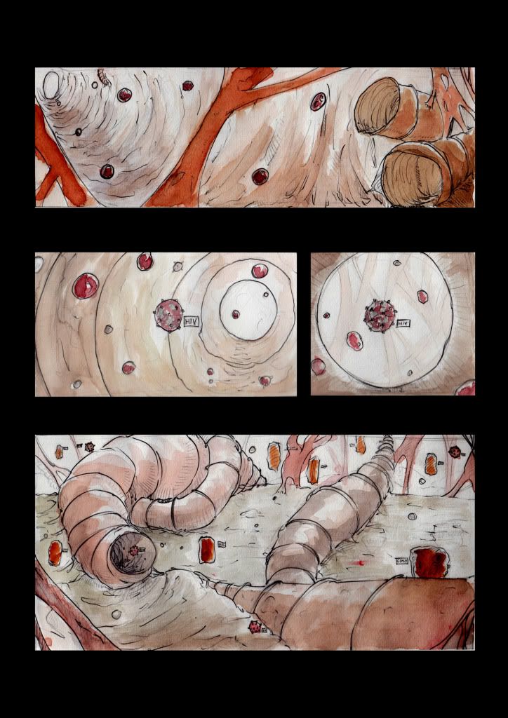
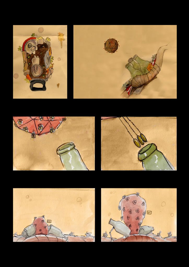
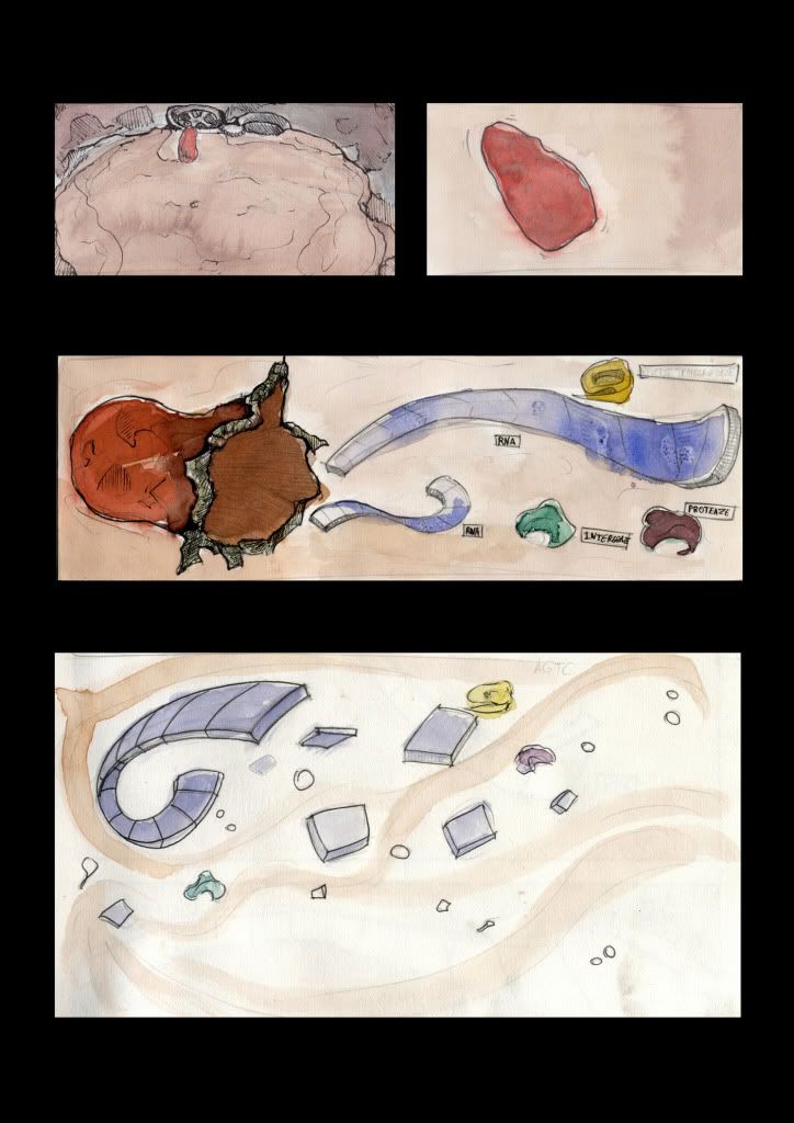
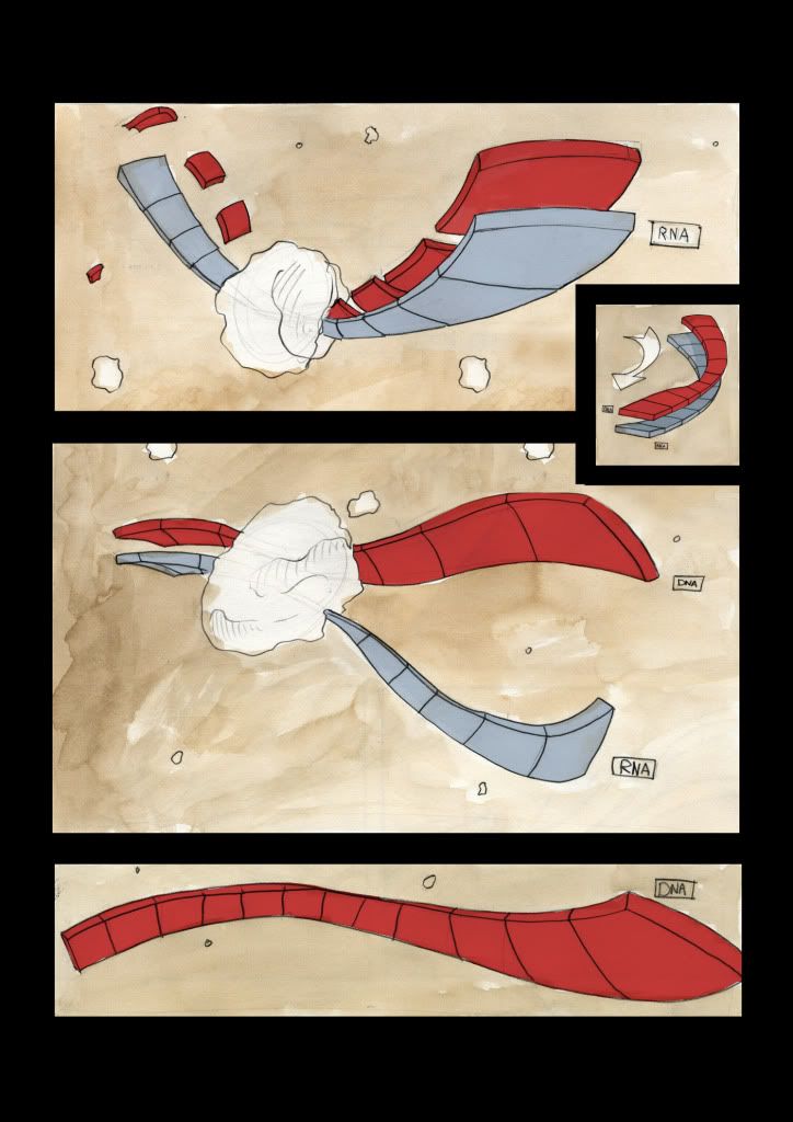
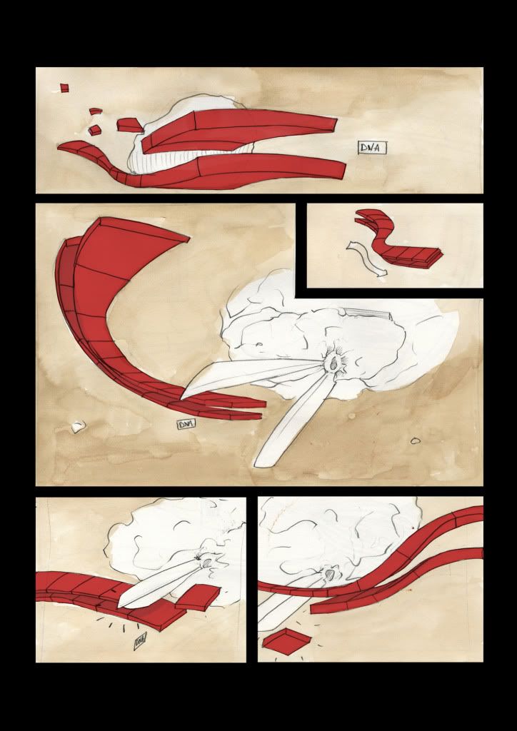
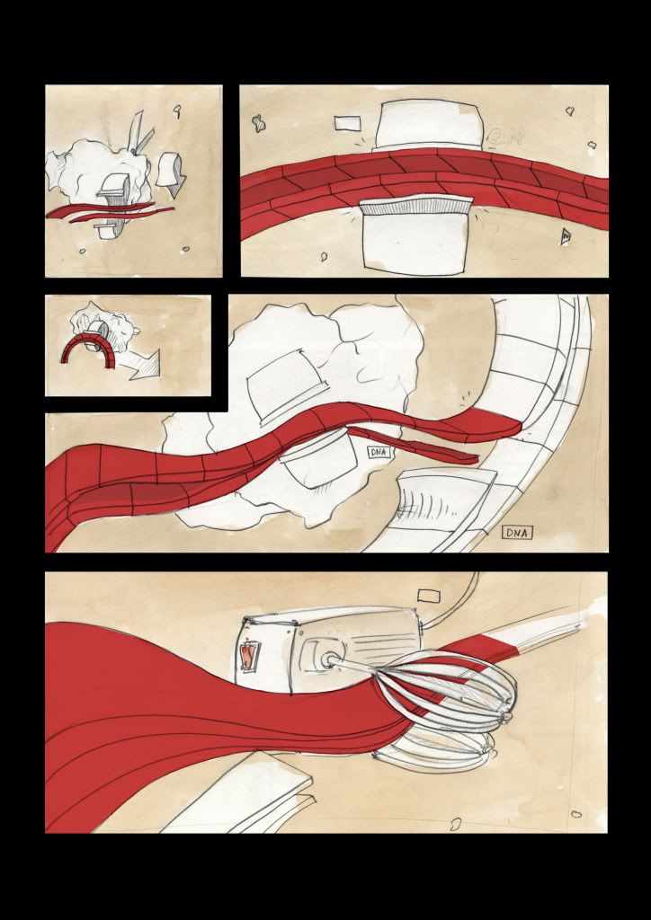
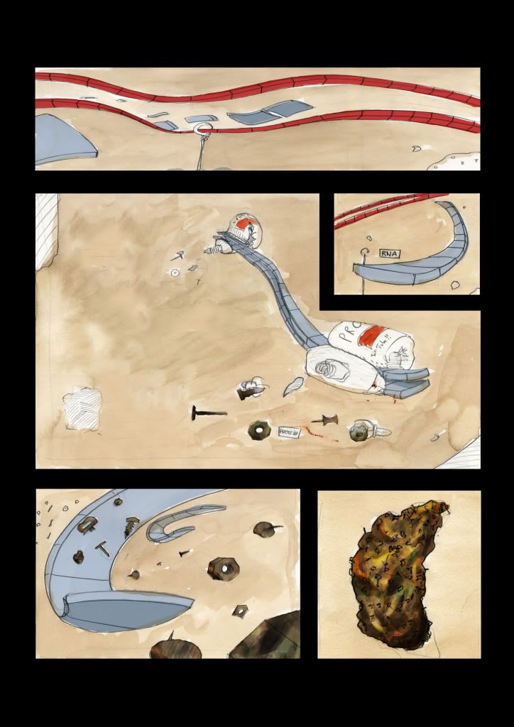
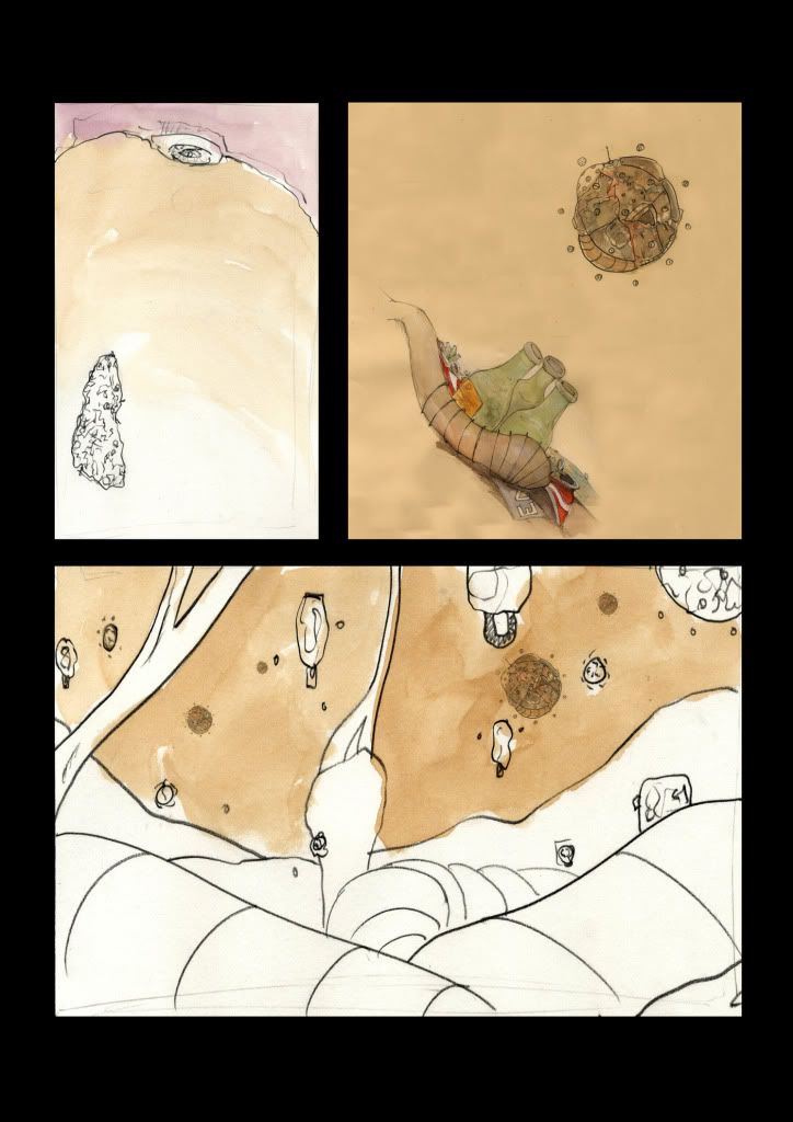
I will post my script and story which should help understand better. I tried different styles for colors, yet most of it will remain in very rusty and recycled. Except the virus.
Their are two themes:
- The first is that in the HIV is created by our own body. After the first influx of external viruses, it is our own cells who start the production.
- The second, which is not included in the storyboard yet (because I forgot to scan it, and I don't have a A3 scanner here...), will be an attempt at mobilizing against HIV. I want to introduce a drawn character who at the beginning is healthy, and at the end of the video ends up dead. My goal is to contextualize the infection rather than just having a disease doing it's nasty job.
Friday, March 4, 2011
Thursday, March 3, 2011
My final Animatic
Finally it is done. I wish I had spent a bit more time on higher quality drawings for it, but time was against me as I had a lot of frames to render.
Thursday, November 25, 2010




Friday, November 19, 2010
Thumbnails
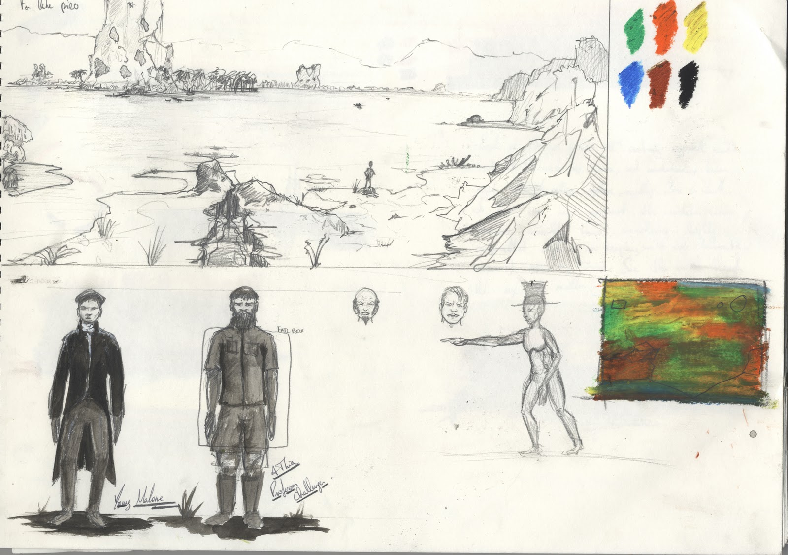
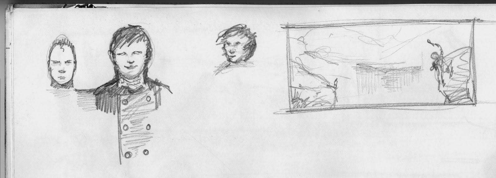
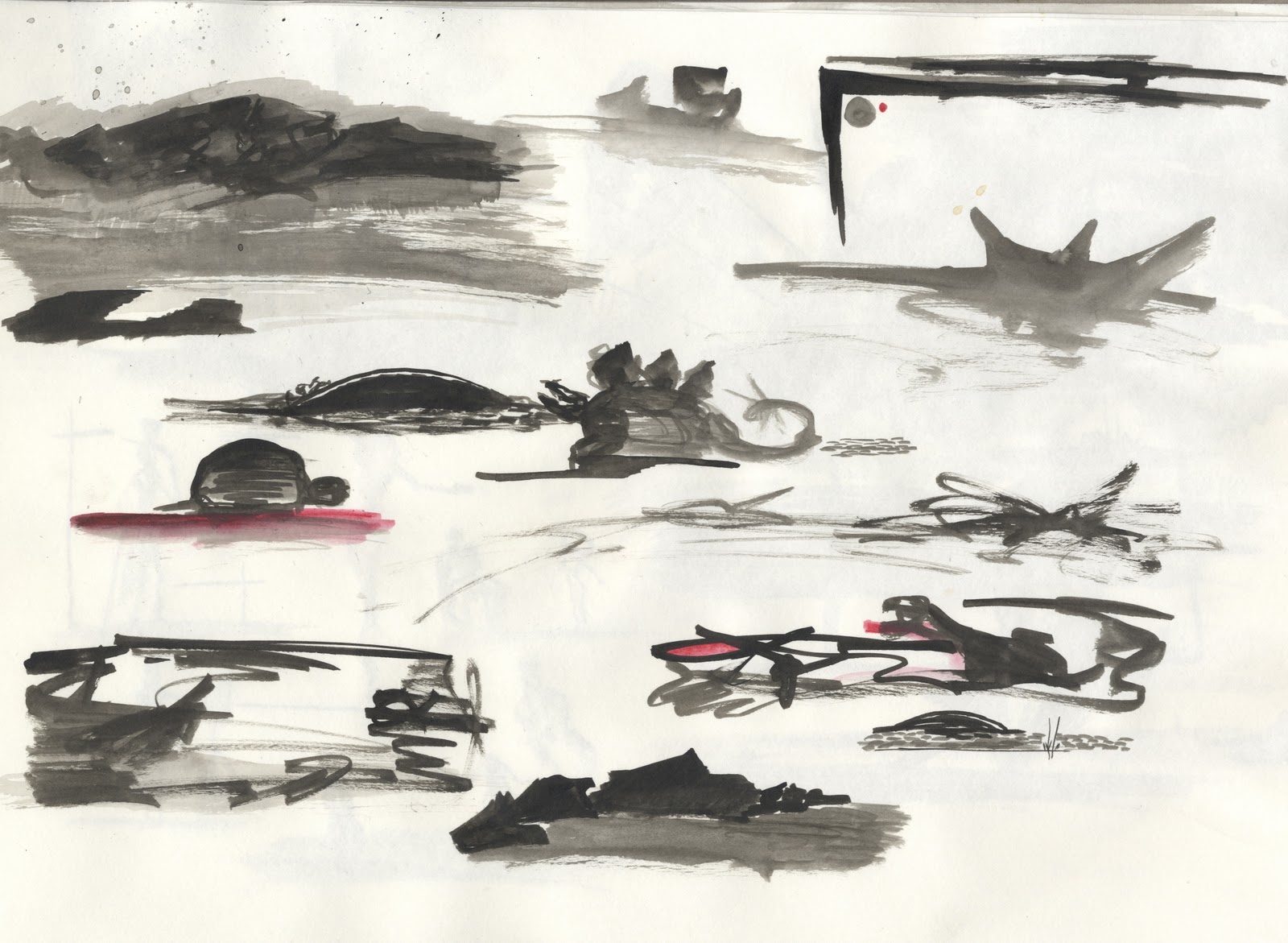
I did these quick thumbnails to try and finalize the details of the third piece. The boat and the dinosaurs will hopefully tie in the piece with the Lost World. Thanks Phill for showing me the Hudson River School, their work really fits my vision for the Lost World, though mine won't be as epic.


Wednesday, November 17, 2010
Some more Research into Colour
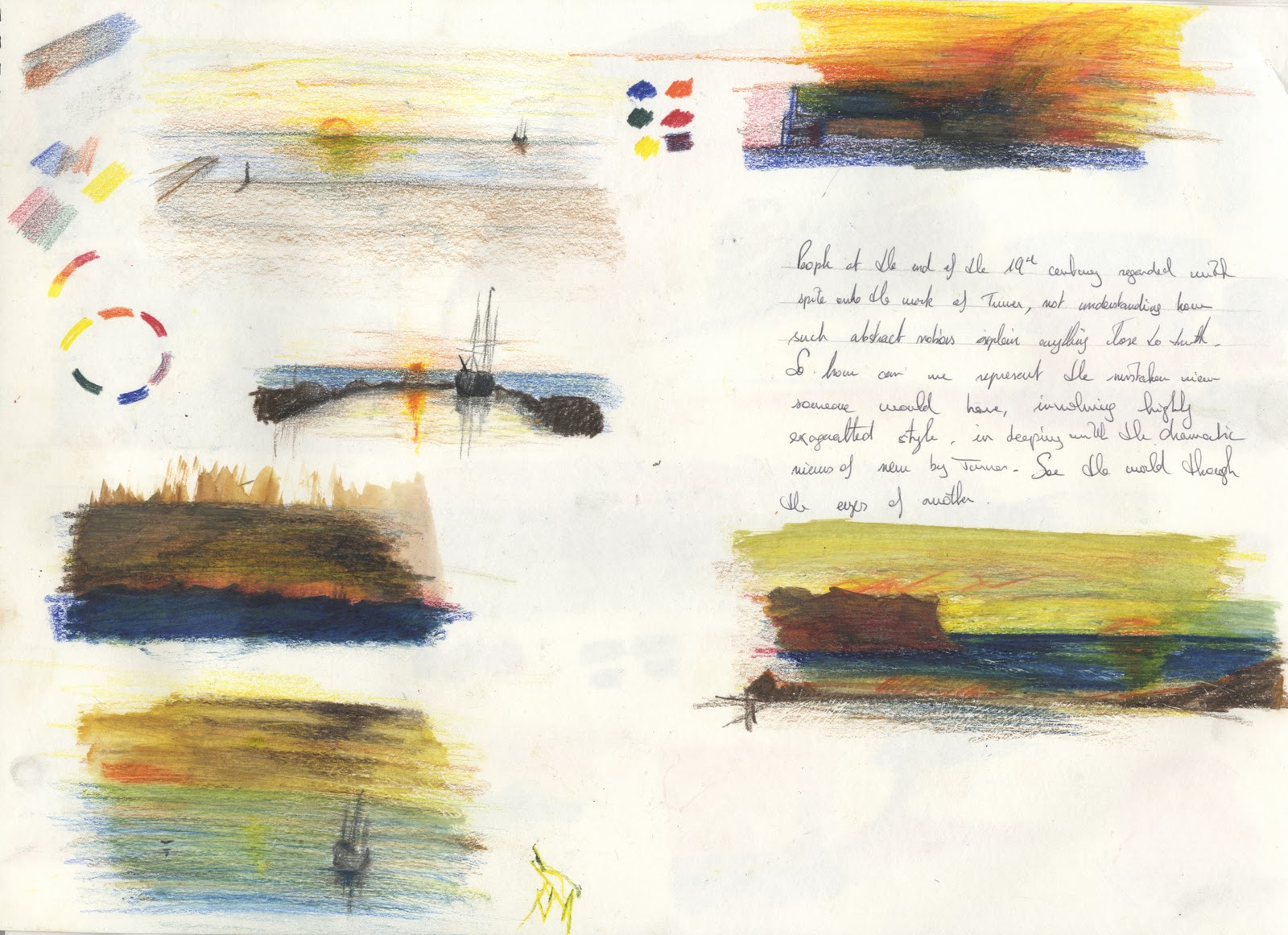
The sky is the essence of a landscape painting, it is the guide, and the road I must follow to convey feeling and emotion. The sky is the mirror of the artist’s emotions, in the same way that the weather affects our moods and behaviours. The sky’s attitude, in conjunction with colours, is most of the time enough to convey the starter emotion in a painting. The sky defines the painting, especially when water is involved in the opposed half. I intend to show water in two of my pieces, and the water will reflect the general colour guide lines of the sky.
I want weather to dominate the painting, to be the soul of Malone, to reflect his urges, his fears, his hopes, etc. He is the final defining factor of my pieces, yet how can a specific weather be linked with a specific set of emotions and still be objective? It cannot, which is why I will base my knowledge on my own reactions to weather, time of day and in general the light present in that moment. The illustrations that I am showing where done in less than 15 minutes, as I just used them to try and set some of the final colours and see if they work together.
For the moment I have three different metrological settings I want to work with. The first is related to the forest scene. It will be a mild weather, with a bright sunlight, sparks of purple and orange specking it, as dusk is not far off. This kind of weather is quit neutral to me, yet with a tinge of excitement and expectation awaiting on the horizon, hence the Tepui seen in the distance and the excitement of the expedition. The reason why I am not going for all out excitement is because a few factors influence the negative side of the excitement, for as with everything, emotions have too sides, or else balance would be lost. The excitement of Challenger is countered by the scepticism of Summerlee and the slight fearful apprehension of Malone. This is still a positive scene, with high hopes and glory awaiting the expedition. The light of the sky will be countered by the deep shades of the trees, reflecting my happiness when the sun is out and yet I can lie under a tree and hear the birds sing. I think this is probably going to be the most traditional piece of all three, not as dramatic as the other two.

The second piece will be the moment Malone arrives at the lake and notices the fires present in the caves in front of him. His excitement is tangible, as he finally feels worthy enough, having done something alone, and possessing information that would be highly approved by the others. Yellow represents rashness and extreme excitement, and it will be the last highlight, that strong contrast that will show is all consuming ecstasy. Its harsh lines will portray his rashness of coming to the lake, and the red that dark and oh so human emotion of self-aggrandising satisfaction of being superior in some aspects to other members of your social clique. I am oscillating between the morning and sunset, though I believe the morning is brighter and a better precursor to bright light. Purple will be the balance, serving to show, through the initial red, the true failure of his soul. He is rash, and always looking for the approval of others, yet he does it in a quest of self-fulfilment. He is highly ego-centric in my opinion, though it is a deeper trait of character, present in most humans. Wind will be blowing, the yellow light giving the impression that he is being burned, by his own will to succeed and by the intense emotions he is experiencing.

The third and final piece will be the momentous peak of emotions and weather yet experienced by the viewer. I will mix in some of his later emotions especially those present during his interaction with the carnivorous dinosaur. The amazing excitement is partly replaced by bold ambition and extreme fear, their mingling creating a maelstrom of colour, dramatic and theatrical, with a central figure implied in its vortex of emotions, the majestic deer. The deer represents nobility and in Celtic legends the preservation of nature. He represents independence, purification and pride, a stark contrast to Malone’s failing soul. An interesting fact is that Celtic tribes and Native American tribes prayed to the spirits of the Stag to help them in their hunt. Malone sees the deer and then finds himself being hunted. What really comes out of the imagery of the Deer in my opinion is majesty and a protection of nature’s sacred areas. The Lost World was not meant to be found, its harmony and balance perfect before the Europeans came and worked their art of destruction. A fitting metaphor for the time, with the Industrial Revolution well underway, but even more actual today, for reasons which I will not explore here as they are all known to us. Back to the colours of the piece, I picture grey, turquoise, beige, vermillion and other lesser colours for contrast and detail. The piece will show raw emotion and the contest of wills going on between Malone and the “spirit” of the Lost World. Closely related to this idea of spirits is the name given to the plateau by the native Indians, the Pemons. Tepui, which means “House of the Gods”.

I want to show a storm in action, though I have a feeling it looks more like a cave, so I will need much more conceptual work on that piece. This is the first drawing I do of it, so it doesn't have as much backup and research as the others.
Research
 |
| Claude Monet Dusk in Venice |
A few defining traits have come out of my early and still very superficial study of colour. Colours influence the emotions of the viewer on a subconscious level, something also reflected in nature. The understanding of colour must come through a deep introspection of our own reactions to colour. Having just seen Avatar, I will explain some scenes I remember off the top of my head. At one point, when the mercenaries prepare to fly of to battle, they are all bathed, as well as the air field, in a slightly desaturated yellow hue. Yellow is a warm colour, inspiring emotions which range from anger to annoyance, though it can also show more positive emotions. Yet the slight desaturation means that it talks on a poisonous aspect, it does not look good visually to the eye, troubling the viewer and causing him to understand the evil nature of the act unfolding in front of him. On the other hand, when we are following the protagonist around the forest, a cool blue tone, accompanied by subtle influences of magenta and cyan, create a soothing almost mystical atmosphere, causing a direct positive reaction in the viewer. The details are almost insignificant such is the power of colour to pass on the basic and pure emotional. We know, through the environment and narrative that we are in a forest area, and that is enough, with the right colours to create the right emotions. A darker red, with bright and harsh yellow spots, while being highly saturated, will dramatically change the overall mood, turning it into a tense and highly dangerous atmosphere.
 |
| Claude Monet Impression soleil levant |
This can also be seen through nature’s gift to animals in need of defence, or in need of a mean to warn others of its nature or intention. The red and yellow, or any bright colour with a strong proportion of yellow in it, such as lime green will forewarn any others that the animal is either a high danger to others or to those who might consider it as edible. In my look into the Lost World, should I show these aspects of colour through the environment, or should I use colour in a less direct way and leave the viewer to feel what ever feeling comes to him. Obviously, the above example on animals wouldn’t be as precise as that of colour in an environment. The second thing is that animals actually sport those colours, while in the “real” world, generic environments usually don’t show such drastic colours. Yet what I will be designing is not the real world, it is a fictional realisation of it. Sir Doyle’s story is based on a real life environment, something similar to the Venezualan Tepuis, massive formations of Precambrian quartz arenite sandstone. They are the remnant of a massive sandstone plateau, who was victim of the erosion time made it endure. They are usually found alone rather than in a range, which makes them superb and highly surreal geographical arrangements. They are home to some of the original and unique species on the face of the Earth, something Doyle’s has taken to another extreme.
Yet what really interests me is how people from the time the book was written would actually picture such an unbelievable story, yet set in their own actual world. An article I read not too long ago sparked my interest into following anther road than the one I am following now. The impressionist where the first to start using colour to show meaning, though what made them really different is that they didn’t use “real” colours, but colours that would fit their vision. Red would not represent the actual colour but rather the anger the artist felt while he was painting. The movement supposedly started when one of the artists was missing black and decided to use blue instead to create the shadow. This confirmed, or enhanced, the idea that black and white where not present in the colour world, with shadows always formed by their complement on the colour wheel.
Though colours are known to impose and arouse certain emotional responses, it is not always the case. Colours do not automatically induce a viewer with a specific set of reactions. The context has to fit the purpose. The impressionist chose scenes that where affected by a special kind of light, a light that makes colour come out in a stronger way, saturating it to bring out its true potential.
 |
| Monet, Le Parlement, Trouée de soleil dans le brouillard, 1904 |
« Le monde des impressionnistes est une combinaison, une solution de liquide et de lumière dans laquelle toutes choses sont plongées et dissoutes, et cette sorte de nuage acide qui les pénètre est aussi le signe de la mouvance générale de l'univers, dont l'impressionnisme compte le temps dans le vent et l'eau qui coule. »
This amazing sentence, in French, resumes romantically what impressionism is. I will do my best to translate. Here it goes:
“The world of the impressionists is a combination, a solution of liquid and light in which everything is plunged and dissolved, and this acidic cloud which penetrates them is also the sign of the general area of influence of the universe, from which impressionism counts time through the wind and the water that flows.”
The impressionist takes art to another level of emotional reaction, seeing the world through the eyes of the materiel and the sensations they generate. Can the Lost World be translated through this way of working? I believe it can, and even I will never be able to reproduce the emotions and techniques used by the Impressionists in such a short period of time and setting, I will nonetheless take as much inspiration and work ethic from them as I can, mixing it with other art theory, flowing through colour and light, hopefully using movement and shape to progress through the conceptual visualisation of the world. This is not as ambitious as hopefully does not sound, as my main goal is mainly a more emotional and understood portrayal of an unknown.
The best way to explain some of my motives would be through a sort of narrative, in which I am a painter from the late 19th century and earl 20th century, and asked to portray the world described in the Lost World. My fictional audience would expect a more realistic view, following precepts instated by the Classical movement a century earlier. I would want their reaction to be similar to the one the actual critics and viewers had of Turner’s first more vague and abstract pieces, they where all wondering what he was actually meaning through his paintings, being a bit disoriented at this new and unusual type of art.
 |
| Turner Snowstorm |
My secondary concern after the compositional attributes of colour and their association with light will be a more down to earth decision on the amount and type of detail to include in the concepts. This remains a world design and I cannot diverge too much past the point where a production crew would have the hardest time trying to interpret the will of the commercial concept artist. I am not a commercial concept artist. Painting art for a commercial use is antithesis to my morals of art as a mean of expression. The paintings will give mood, tone and hopefully, a definite colour palette, along with a distinctive light to give the Lost World a true visual sense.
 |
| The main colours I which to use in lake view. |
Out of the three scenes, I already have an idea of the colour range for two of them. The lake vista will be dominated by warm hues, a bichromatic association of yellow and red, including everything between them. To keep the scene calm and peaceful, I will keep an analogous scheme, with the inclusion of violet to smoothen and calm the whole scene. Yet the sharp points of almost golden yellow will contrast with it to still create some sense of danger, and to forewarn the viewer of misleading peace. The purple should serve to induce the scene with a slightly more surreal look to the scene. Green as a complement will be implied for vegetation. Details will be vague, as I am asked to represent space, which I will do through shape, colour and light.
The second piece, the forest, will revolve around a cooler and darker scheme, with a dominance of green and a neutral variation of brown, with a cool shadowing of blue. The spot complementary use of red should bring out the colour and create some focus for the eye, red also showing danger and anger, though how the viewer will interpret is not for me to decide, my only power now is only to suggest these possible emotions and work my best so that they convey my intentions.
Monday, November 15, 2010
Research for Final Pieces
Worked on the composition for a possible first piece, played with shapes and detail. I hope this describes space well enough. I wanted to give the Tepui a sort of mystical look, as a holy grail almost impossible to reach.

The shape of the trees point towards the Tepui, hopefully guiding the eye towards it. I think I will surround it with a halo of light, present right on the top of it, which will bath the whole scene in a sharp light, which will create a sharp contrast with the strong shadows.
I will play mainly on the colour and light, creating shapes through their inherent contrast with each other. I will stick to pure desaturated hues when it comes to the high light exposure, while saturating the tonal values when entering the shadows, with low values. An interesting fact found by Michel Chevreul, a chemist who worked on the relationship of colours between each other. He said that and object of any given colour will cast a shadow tinged with that of its complementary colour, in the same process tinting neighbouring colours with its hues.
 |
Regarding colour, an interesting text on Van Gogh’s Café Terrace on the Place du Forum, Arles, 1888 and Night Café in Arles
“Our sensation is the most intense where two extremes are juxtaposed. Van Gogh’s Night Cafe composes colours described as “warm,” which are generally associated with such sensations and emotions as energy, joy, love and festivity. In his letter to his brother Theo, van Gogh considers the work as “…one of the ugliest (pictures) I have done… I have tried to express the terrible passions of humanity by means of red and green.” By using colour in this manner, van Gogh exploits the psychological capacities of colours to arouse emotions, here intentionally creating a jarring unpleasant sensation for the viewer. Contrast this with the entry on Picasso and his “Blue Period,” where the paintings arouse emotions more usually associated with “cold” colours, such as sadness and a withdrawn quality.”


What does this imply? Should one avoid complementary colours when he wants’ to avoid too strong emotion and break the union of his painting? Colour allows the artist too control the emotions of his painting. In landscapes, having a warm hue reflected across the horizon plane creates a sense of serenity, of quietness, while a cold use of blue straight away changes the emotions involved, creating insecurity, and wariness. Does adding spots of warm colours increase the warmth of the painting or does it create even more insecurity as the viewer finds himself left out of the warmth and happiness of the spots. Here I tried conveying relaxation through a warm glow of orange, while avoiding sharp shapes of cool and opposite colours. Their are not many details, as my intention was emotions through colour rather than view and excessive detail.

Yet when Mallone finds himself sitting next to the lake, looking across at the fires reflected in the troglodyte caves, he feels happiness and deep sense of well being, though this is mainly due to the rash happiness of having found human life and being able to report it to his colleagues. So can colour represent the rashness of human emotions? Warmth creates a soothing emotion though it also represents anger and quick temper. So how can I represent a certain aspect of warmth without evoking too much of the opposite. The same comes with the cold representation of colour. I believe this resides in their association between each other. Red and Yellow would invoke anger, while Red and Blue or Purple will be more soothing.
Colours respond to one another and on the result of their association do the emotions conveyed depend. Delacroix worked under influence from Goeth’s theory of colour, saying: “Give me the mud of the streets and I will turn it into the lucious flesh of a woman”… if you allow me to surround it as I please.” This perfectly exemplifies how the use of colour, no matter the origin and their “nobility”, can be used to convey anything the artist wants as long as he is capable of associating the right colours.
Turner, who is my main influence on colour and the characteristics of light, was also an avid follower of Goethe’s theories, though he used them to as he saw fit, in accordance to his painting beliefs and objectives. “Turner responds to Goethe’s “plus” and “minus” colours that address both the eyes and the emotions. The “plus” colours of yellow and red-yellow excite lively feelings, while blues impart gloomy and melancholy emotions, or “the impression of cold.”” I will furrow deeper into Turner at anther time this week.
Now on the use of colour through my own paintings.
Though I can understand the basics of colour association, I want to understand more, to be bolder, and convey what is needed, while at the same time defining the looks and emotional feel of the Lost World. See you next time.
Thursday, November 11, 2010
Some change
Just did this to get away from the rest, though I was thinking of Malone when I was drawing this.


Turquoise
Played around with the Turquoise, needs to spend some more time with it, but I like the association of turquoise and red. Ill try and subtly intergrate it into some of my piecs.


Playing with Couleur
These are some quick colour tests I have done. I am trying to find the best colour combinations, playing with complementary colours, opposite colours, find some third spot colour to complement the first two, etc. Playing with shape and mark making, their is some Rothko and some Kandinsky, as they are some of the greatest masters of colour. Burke suggested that too much details blocks the mind from actually understanding the deeper psyche of the artist, to understand his motives and the emotions that went into the piece. I am therefore avoiding excessive definition of detail and keeping it as vague and open as possible.
I will do much more of these, for, even though as a concept art they are not relevent to my book, colour composition is in my eyes essentiel and the foremost element in a painting. It creates the painting, it makes come alive and it relates to the inner consciousness of everyone else. There are a lot of factors involved in the success of a painting, anatomy, perspective, space, and more, but none can achieve its purpose without colour. The sum of all things but colour will result in a sum that is equal to its components. Adding colour will turn an equal sum to something greater than the sum of its components. I do not feel I have a strong enough understanding of colour to be confident enough in my more realistic paintings.

Some Rothko for Colour

This one lacks something. I think that using the same red as in the background inside the blue shapes was a bad choice as it makes the whole piece too red.

Kandinsky is the obvious influence here. I wanted to try shape and colour and finding something pleasing to the eye. The red, blue, brown combination works quit well, while the light orange, more a milky orange in fact, fails to do anything positive. Same with the turquoise which I do not like. I think it works better in a monochromatic, or bichromatic association, where white is more important. Using a faded red as a contrast should work out, will have to try that out.

Working with opposite colour, with green touching blue, I attempted to find a corelation between the two, and felt some success with the darker green, but the lighter green, mixed with the yellow, creates a really negative response with the blue and ruins the whole composition.

Purple, Green and Yellow. Not too sure about that one.

Subscribe to:
Posts (Atom)