Showing posts with label Environment. Show all posts

Wednesday, October 5, 2011

Getting back to Photoshop

First piece on Photoshop for a while. It's good to use it again, especially when using a cintiq. Just a random composition made with a few pictures and a lot of editing and colouring. I was wondering if I should put a black border as it seems to look better with it. I went without in the end but I might change that for the print. 

Tuesday, February 22, 2011

Personal Painting

Something I did to get away from the project for a bit. Now back to work.

Friday, February 11, 2011

Concept Art - Environment - Street - I

Started some concept art on the streets, as I am not too sure on the style yet, I am going quit abstract, using some photos and playing around with colours. I like the colours in this one, though I will probably go for a less yellow look. I want the buildings to have this hue though, as I really like the warm beige to yellow colour quit representative of the south of Europe. The more I think about it the more I think I will set the scene in a small village of the South of France, where warm colours are more developed.


The scene was done quickly and is mainly meant to give some ideas and colour range. So perspective and all of more specefic techniques are not as important right now.

Friday, February 4, 2011

Skyline Practice

I am now using some photo reference to paint my skies, I feel it gives that extra edge of realism that was lacking in my other pieces. It's not a carbon copy of a photo but it uses its details and general shape. This should enable me to produce purely imaginative pieces that are more believable than before.

Monday, January 31, 2011

Experiment

Experimented with some new techniques, playing around with textures trying to get something interesting. Not to happy with the final result but you learn everytime some all is good.


Thursday, January 27, 2011

Personal Desert Painting

Experimenting with light and techniques. I still have trouble adding more to a scene. I reach a point where anything added ruins it for me. So got to practice that.

Wednesday, January 26, 2011

Personal Ship Painting

Had some fun painting a ship image. I am still trying to get more dynamic images.


C&C welcome.

Thursday, January 20, 2011

Matte Painting

My Prison is in the air, on top of a high tower. I want to also give a sense of height to the scene, accentuated by the low point of view.

Wednesday, November 24, 2010

Monday, November 22, 2010

Some Progress

Looking for advice on the character on the right, if he is well integrated or not. I feel he has too much light on him. I am wondering if he is not better in a really dark shape.


Some more trial and error

I wanted to try another composition but finally I'll go back to an earlier concept and work off of that.


Friday, November 19, 2010

Not happy

Ok I though I could have turned this into my final piece, I even started it in a 16:9 format, but I don't like it, something is wrong, so unless anyone has an idea on how to fix it, I am scraping it and starting again.

Having done all my other paintings on an A4 format means I need to rethink completly my painting and composition strategy. The painting is too milky.


I am scraping that the more I look at it the more I hate it. This is done.

I have got the week-end to come up with all the right drawings for my three pieces, so that I can concentrate on the final painting.

Thursday, November 18, 2010

Another preparatory drawing

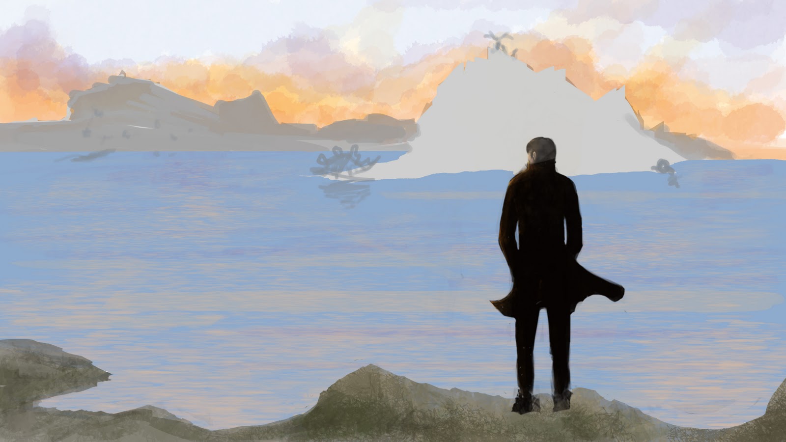
I stayed with the same tonalities, red and blue, yet I am not too satisfied with it based on the project. I will talk about what is wrong in this picture and hopefully try and fix it.

- I feel it needs a bit more Lost World, without altering too much the image into a gag like Jurassic Park.
- I want the colour storm to be more present in the foreground.
-And more but I am not sure what it is.

If anyone has any advice my ears are open.


I still need to find a way to include a deer in there, as I feel he is essential symbolically to the piece.

I have a feeling I should go more towards the turquoise and salmon pink of my earlier concept, though I am not too sure yet, probably of mix of the two sets, red-blue turqoise-salmon pink, would be preferable. 


Their are more variations in the colours, which makes this piece chromatically more pleasing to my eye.